Always, research
It was relatively simple ask, and I was starting from a safe place. The original look of the status board could be much enhanced with simple changes in spacing and swap of assests. I could have been changing the look of it, but I wanted to see it being used in the context, and talk to people who might have insights that I could not catch just by looking at the screen.
I visited the surgical center and observed family members who are waiting for their loved one’s operation to be finished. How often are they looking at the screen? How far away can they be from the screen? Additionally, I requested to talk to a floor receptionist and a nurse who is frequently interacting with the family members at the lounge. It was a day trip to the surgical center, and I have learned so much that I wouldn’t have learned just from the screen.
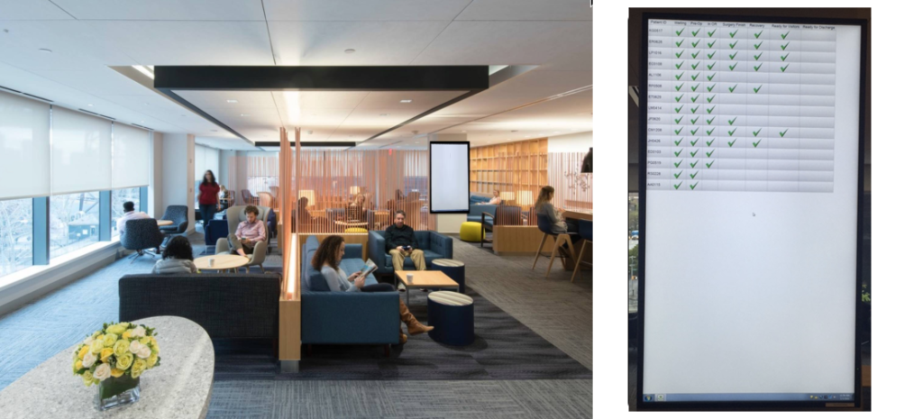
^ The view of the family waiting area (left) and a close up photo of the original status board (right).
Learning from research
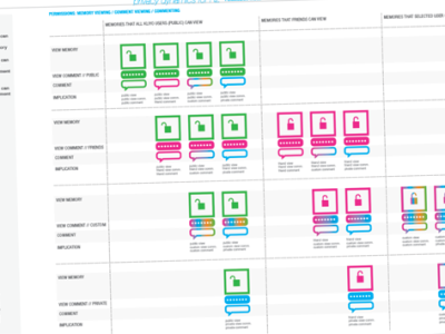
- The board gives a sense of visibility into patient’s status as a quick reference, but patients rely on staff for deeper insights (esp. nurses)
- There are some misconception about the process when family members come as a visitor, and nurses minimize the gap (require changes in the label)
- Other people’s progress or timeline does not provide meaningful information (the board looks like it’s a race! This view might be useful for operations manager.)
- ‘Complete’ has an important distinction
- ‘Ready for visitor’ triggers action, but other steps are informational
- It’s hard to read from far away
- Timestamps might provide higher clarity
Guiding Principles & Features
Based on what I have learned, I set some basic design principles that can guide me throughout the design iteration, and ideate features based on them.
Glanceable
Viewers need to be able to quickly identify who they are looking for, and they see the screen from across the room
- Legible from a distance
- Quick index to find who I am looking for (alphabetized)
Guiding
Viewers need to understand where in the entire process the patient is and what each step means
- Individual focus (My patient’s status takes priority than how everyone is moving through)
- Patient/family friendly language
- Process indicator
- Flashing for action queue
- Timestamp
Flexibility
The design needs to fit for both portrait and landscape (for future implementation at other facilities), and accommodate 15 ~ 50 items in the list (average number of patients a day)
- Flexible vertical spacing based on patient volume of the day
Design Iteration
I used a large conference room monitor to design. It was handy to check legibility from a distance, and see how it can feel when the design is live in the space.
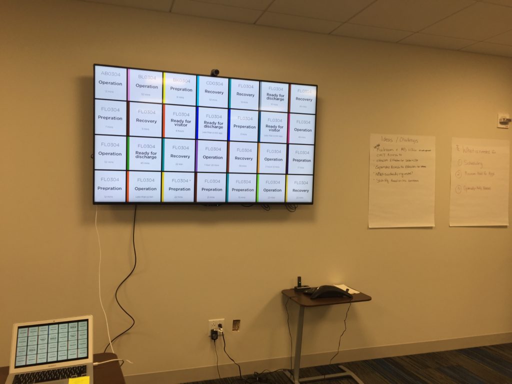
^ Designing for large screen.
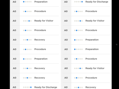
Final Design
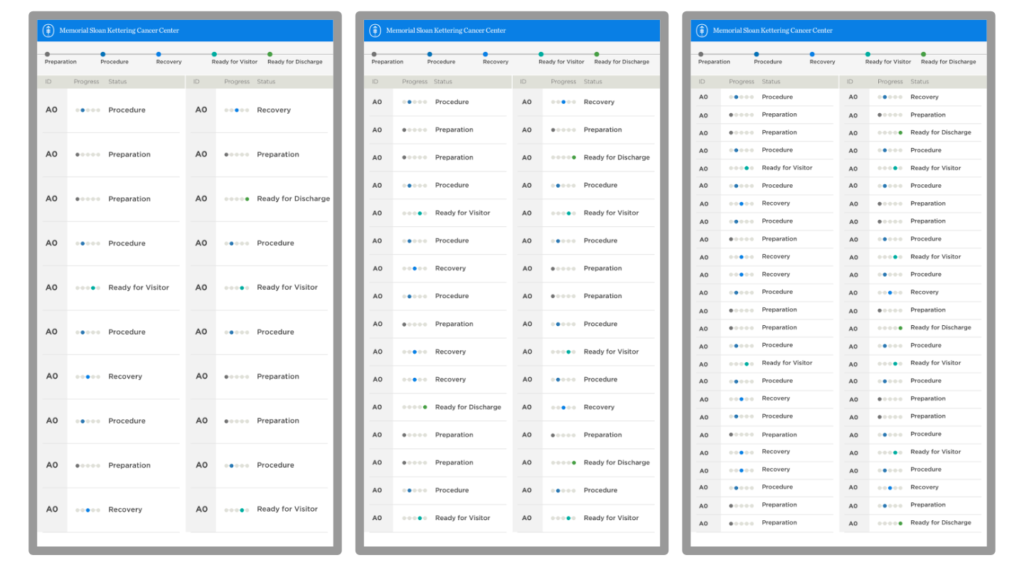
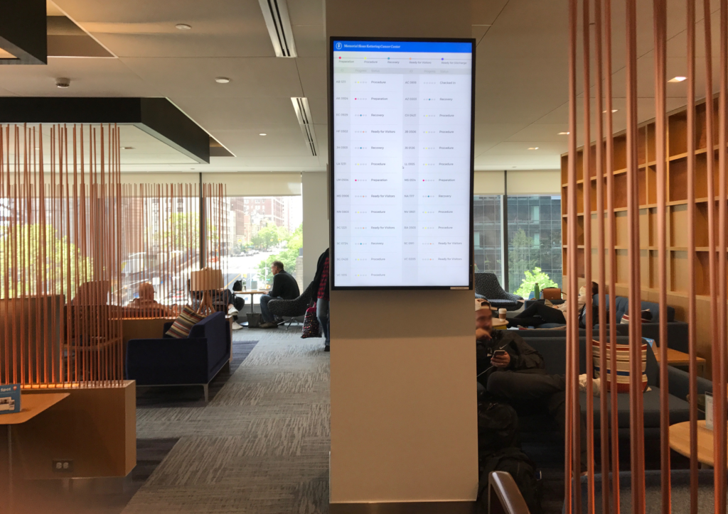
^ Sample images of the screen. When there are 15 patients ~ 50 patients.
Design for staff facing tool
The original proposal was to change the look of the screen. However, to make the data more accurate, it needed to have a staff facing tool that a staff member can manually update the status of individual patients.

^ Sample screens of staff side tools.
See it in action!
^ The new design has been implemented and up and running.
- Research – Design – Implementation
ROLE
- solo designer
CHALLENGE
- scoping differently than what is originally asked
RESULT
- the design has been implemented
- used modern tools (Sketch, Invision and Zaplin) to collaborate with development team, and the process was showcased as a best practice of collaboration


 ^ Sample images from the final design